This is the final project for my first-year typography class, with the client being World Animal Protection. The challenges for this project were to find a good document size to fit all of the information, to create an infographic for the middle spread and to only use typography in the layout (company logo & graphs were exceptions). My design solution was created to be similar to their Global Strategy 2015-2020 document so that it would fit in with their style of publication and brand identity. The key difference being that I solely used type in the design and the colour palette is based off their website.
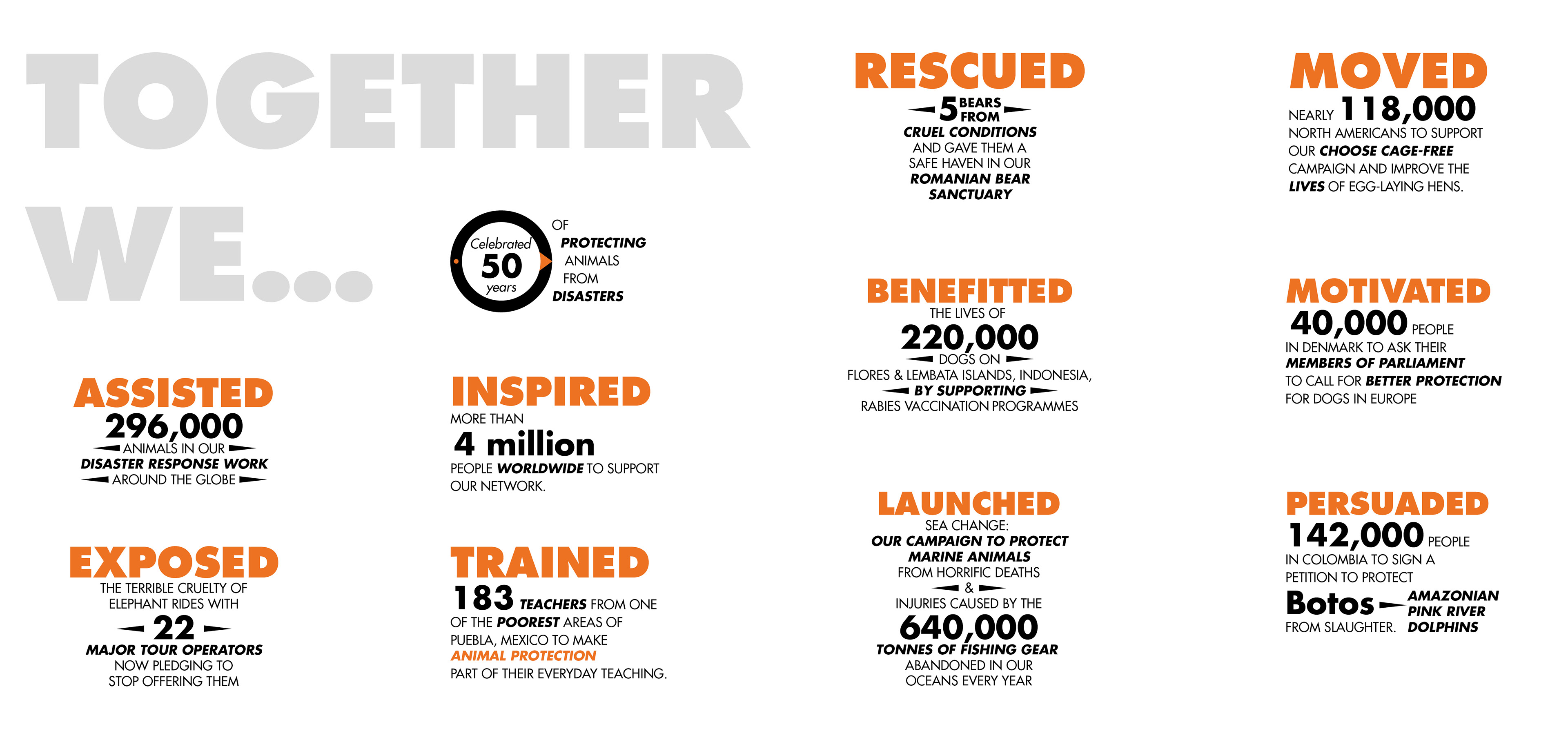
Two objectives that created a challenge were — to design the annual report so that it fits with the World Animal Protection brand and to create it with type only. After reading through their global strategy I decided that I would use the idea of title's having a page of their own with a subheader or intro, to create a strong hierarchy, readability, and to clearly inform the reader what they are reading. These pages also became a good replacement for full page images as they are attention grabbing and informative in a similar way. To give the body copy some visual appeal and a unique visual flow I aligned each column to the bottom of the page and, where possible, I arranged the text so the columns would descend in height. For the infographic, I combined what I did with the title pages with their logo, using a big bold title with the information typeset with similar hierarchy as what is in their logo. As I wanted this page to stand out a bit more than the others, the type is set in the black and orange of their logo versus the other pages being set in the colour palette of their website. To add a visual rhythm to the infographic, I grouped the information into two styles to stop the reader from getting bored and to make the text more appealing to read.