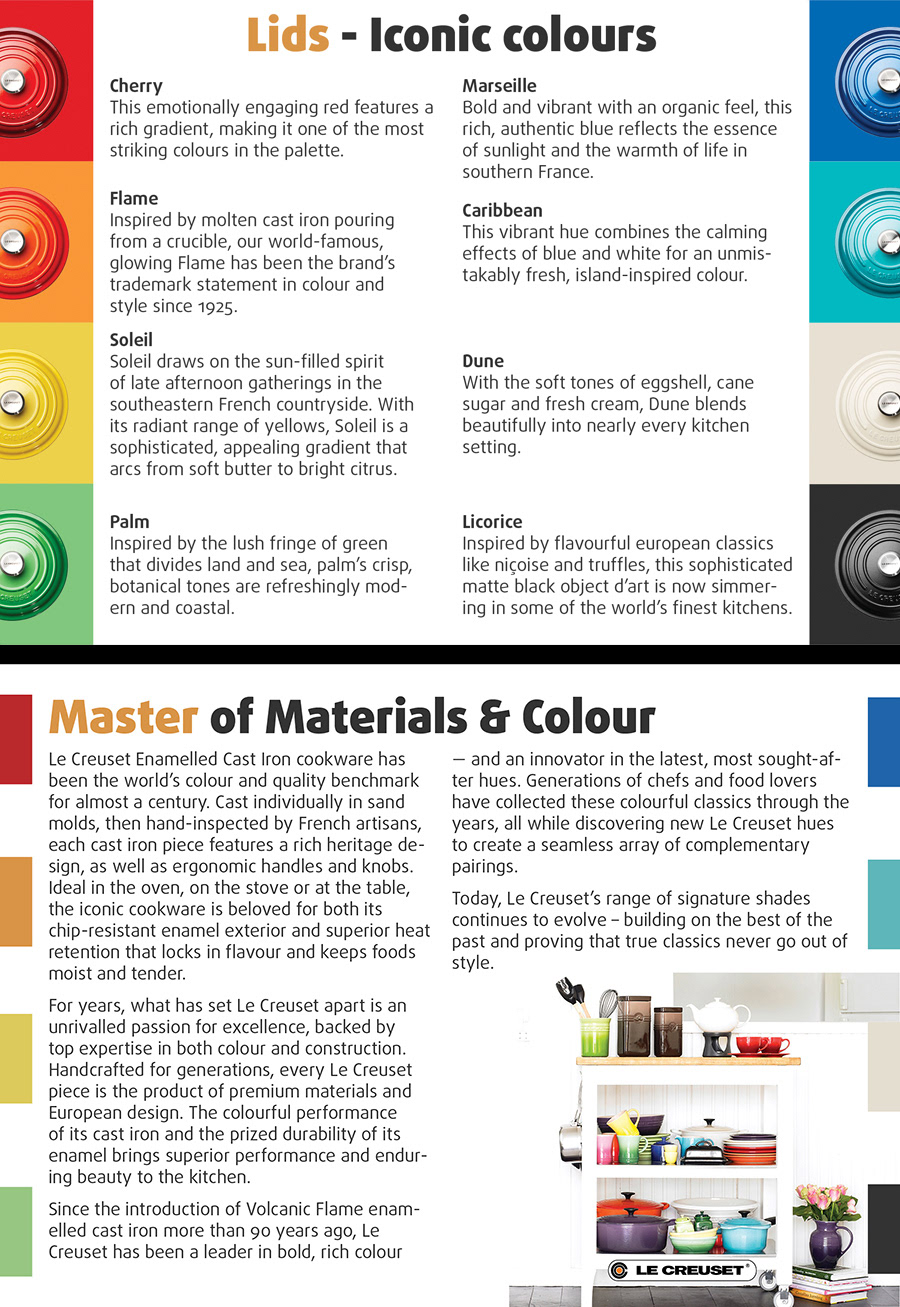
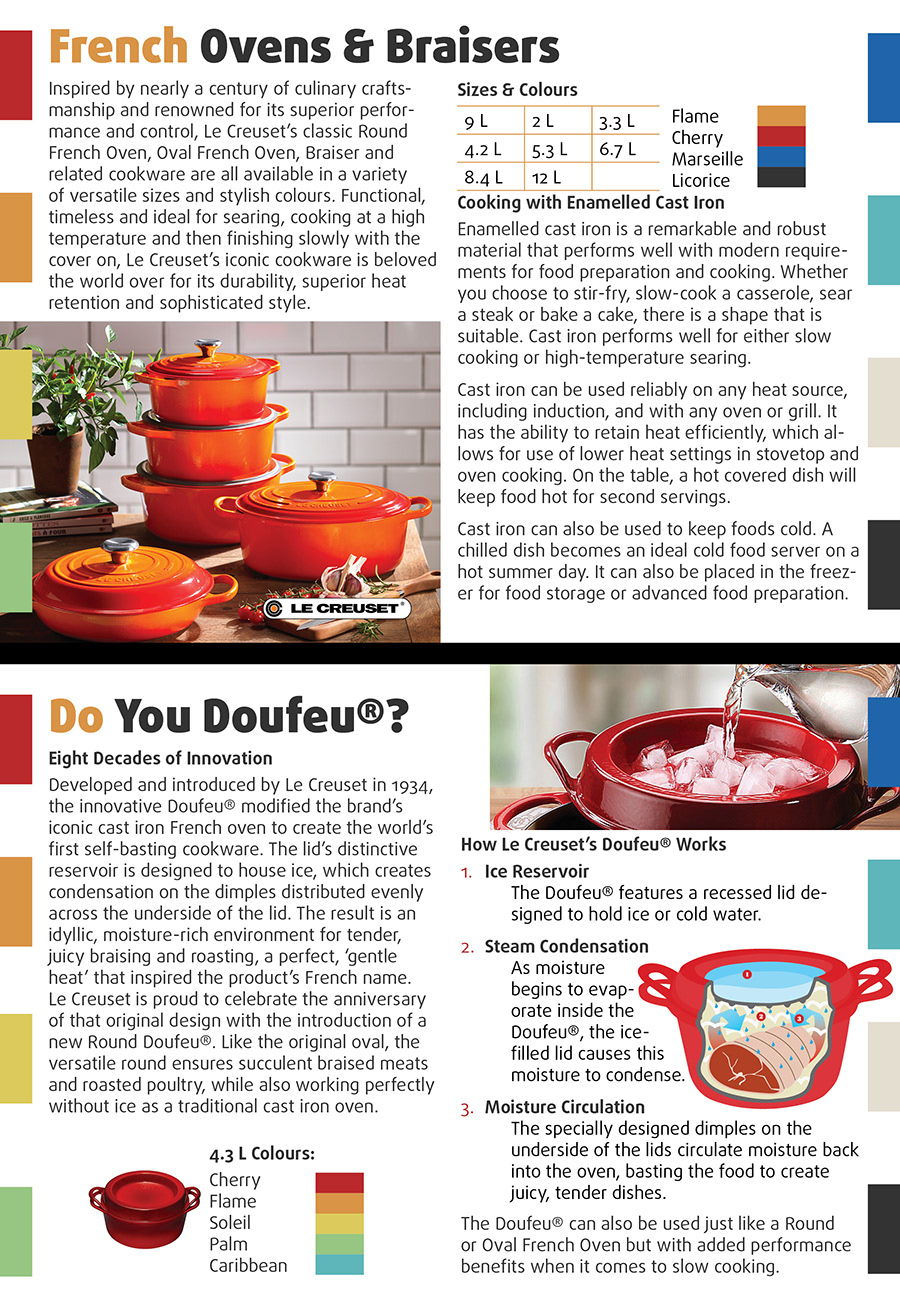
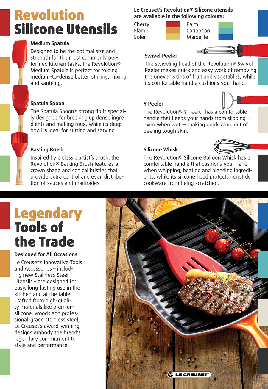
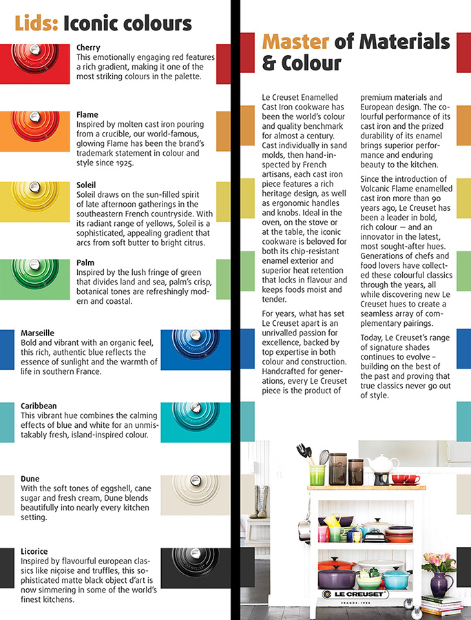
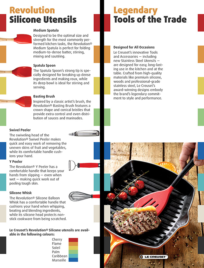
Rack card designs developed for my Computer Graphics class. The goal was to research the company (Le Creuset) and read the given content to come up with a design that emphasizes an aspect of the company. The second goal was to make the design dynamic enough to be applied to two different sized documents.
Since Le Creuset is known for their vibrant colour use, I chose to focus my design on colour. I used the colours from the supplied images of their products to create the colour palette for the repeating graphic elements running down the sides of the cards. Each card title utilizes the brand colours of Le Creuset (orange and black), using the orange to break up the titles and giving them some life.